Styling and Customizing Your Product Tours
This guide is designed to help you seamlessly customize the look and feel of your flows, ensuring they perfectly match your website's design language.
By following this guide, you can effortlessly customize the style of your Bonboarding flows, making them an integral part of your web app’s user experience.
Getting Started
Upon signing up for Bonboarding, our innovative StyleSync algorithm automatically analyzes your website to determine its basic look and feel. It then suggests colors, fonts, and styles that align with your site's design, giving you a head start in creating flows that seamlessly integrate with your web app.
Customizing Your Styles
While StyleSync provides a solid foundation, you have complete freedom to tailor the appearance of your flows according to your preferences. Here's how you can make adjustments:
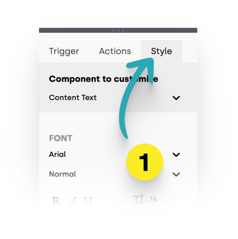
1. Access Style Settings: In the properties panel, go to the 'Style' tab.
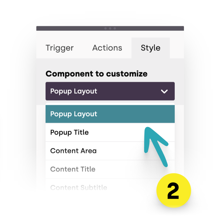
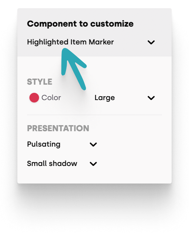
2. Choose the Component to Edit: Use the dropdown to select which element you want to customize.
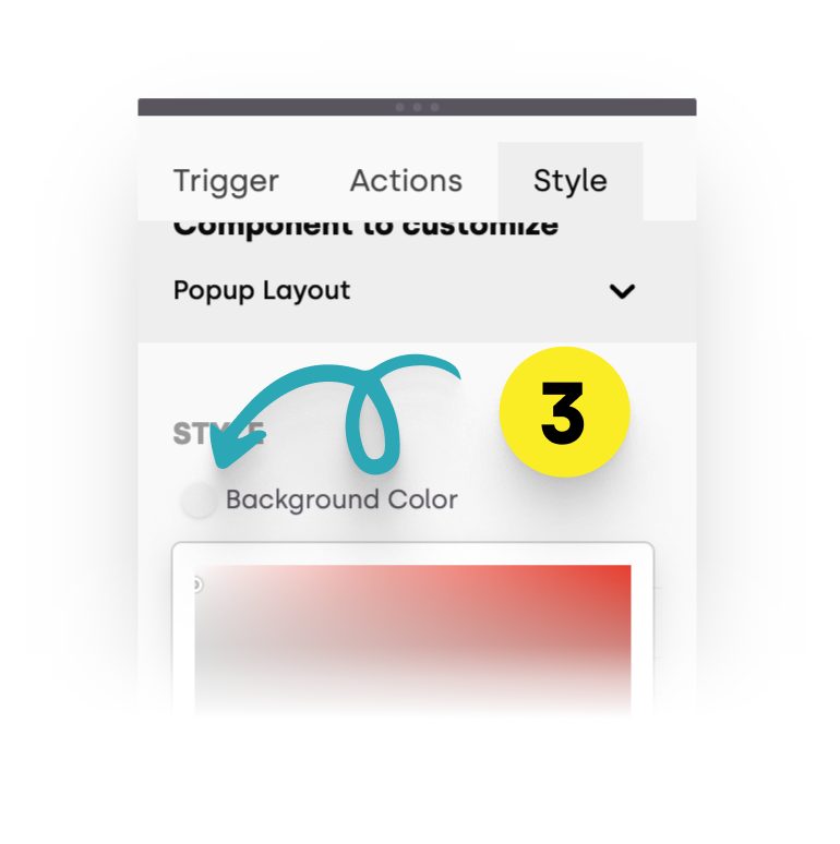
3. Adjust Anything: Change colors, fonts, and other elements to match your brand.
Your style changes are automatically saved.
The preview icon indicates when saving is in progress, providing visual feedback. 
Configuration Options
- Colors and Fonts: Customize every aspect of your step's appearance, from text color and font type to background colors.
- Rounded Corners: Adjust the corner radius for a softer or sharper look, all without touching a single line of CSS.
- Backdrop: Change the backdrop color and opacity to ensure your steps stand out above your content.
- Paddings: Modify the padding of your steps to ensure they look just right.
Tips for Styling
Here are some additional tips to enhance your styling process:
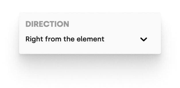
Highlight Layout: For highlighted elements, you can specify their position relative to the target element in the "Highlight Layout" component.
- Color Changes: Modifications take effect once you close the color picker panel.
Marker Beacons: Customize the color and animation of marker beacons to ensure they grab attention.
Text Editor Formatting
The text editor offers inline formatting options:
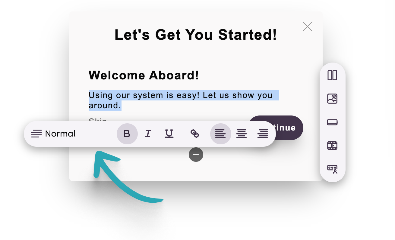
- Text Formatting: Select text to reveal an overflowing menubar with options for bold/italic text, alignment, headers, links, and more.
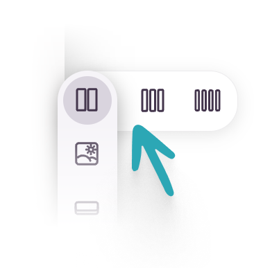
- Multi-Column Layout: Use the
 icon to split content into 2, 3, or 4 columns.
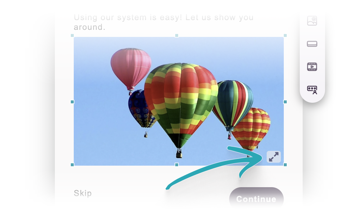
- Image Adjustments: Resize images or extend them to utilize the available space.
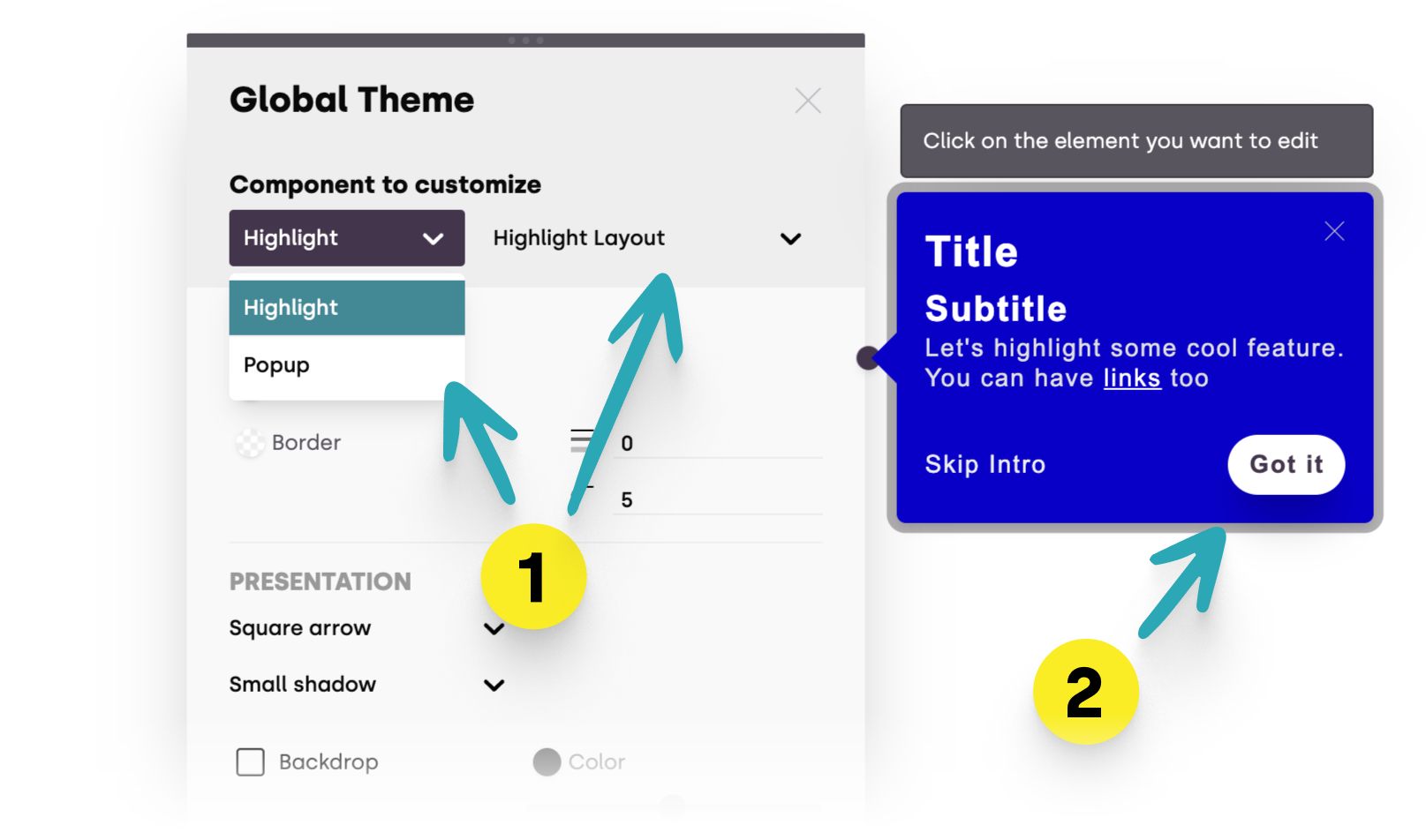
Global Themes
To avoid repetitive adjustments across multiple steps, you can edit your global themes in Bonboarding. You can open it by clicking on the  in the menu bar.
- Element Selection: Choose elements (popups or highlights) and their components either from the dropdown menus (1) or by clicking on the parts you want to customize in the preview area (2).
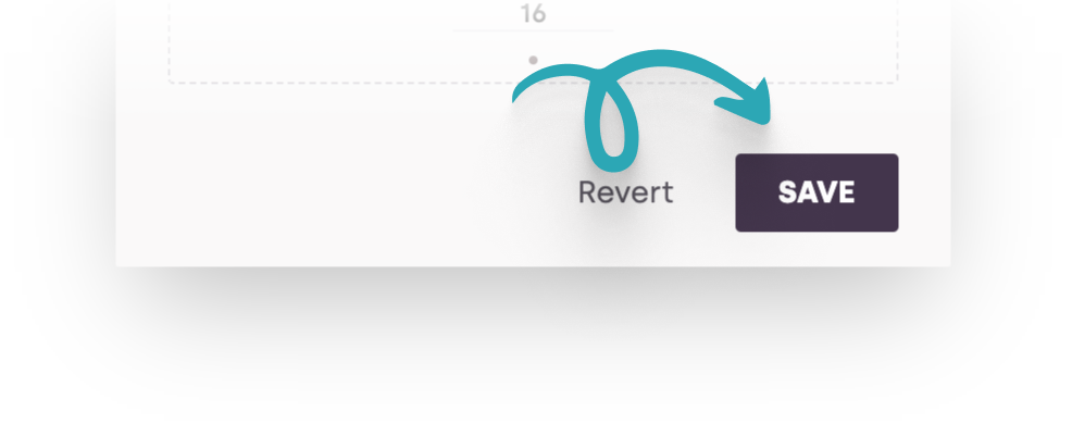
Global themes are not autosaved! You must finalize your changes by pressing the "Save" button. All newly created elements will inherit these styles across all your flows.
By following this guide, you can effortlessly customize the style of your Bonboarding flows, making them an integral part of your web app’s user experience. Remember, a well-designed onboarding process is key to retaining users and encouraging product adoption. Happy customizing!